
Moonwater Beverages
Client
Moonwater Beverages
Branding
Years
2022 – 2025
Original Branding | 2022

The original branding was strategically misaligned with its core identity, creating the opportunity for a complete brand overhaul.

First Rebrand | 2022 – Mid 2024
The brand underwent a complete revolution, adopting a bold, craft-inspired emblem designed to evoke an adventurous feel, with its mountain iconography drawn from 'The Sleeping Lady' of Lake Lure, NC.
Further Refinement | Mid 2024 – Now

Finally, the identity was evolved and matured through targeted refinements, including bolder lines, the rounding of sharp corners, and the elimination of unnecessary detail. These changes created a stronger, more confident brand presence and ensured the logo is now highly readable at all sizes without sacrificing its core branding.
To supplement the primary badge, a horizontal wordmark was created to ensure brand consistency and flexibility across all potential applications.
Brand Cohesion: Utilizes the same bold, custom typeface found in the primary emblem, creating a unified visual system.
Subtle Storytelling: Features a stylized wave element extending from the wordmark, providing a direct visual nod to the "water" aspect of the brand in a clean, modern way.
Maximum Versatility: Specifically designed for use in website headers, email signatures, packaging sides, and other horizontal formats where the circular badge is not suitable.
System Component: Acts as a vital part of the brand toolkit, allowing Moonwater to maintain a strong and consistent presence across diverse media and formats.

The "Wave" Horizontal Lockup
Beverage Packaging Design
Client
Moonwater Beverages
Years
2022 – 2025
Original Packaging
The original Moonwater packaging served as the baseline for the rebrand, featuring a sterile, wellness-focused aesthetic with minimal personality. While professional, this conventional approach was misaligned with the product's true identity as a modern THC beverage, lacking a strong brand story and therefore necessitating a complete strategic reinvention.
Packaging Redesign | Phase One


The first phase of packaging redesign established a cohesive and scalable packaging system to launch the new brand identity. Each label was built on a consistent framework: the new circular emblem served as the primary anchor, set against an Apollo mission-inspired topographic map to reinforce the brand's story. A simple color-band system was introduced to differentiate flavors, such as pink for 'Fizzy Punch' and yellow for 'Fizzy Lemonade', creating an intuitive visual language for consumers and a flexible foundation for future products.

Packaging Redesign | Phase Two
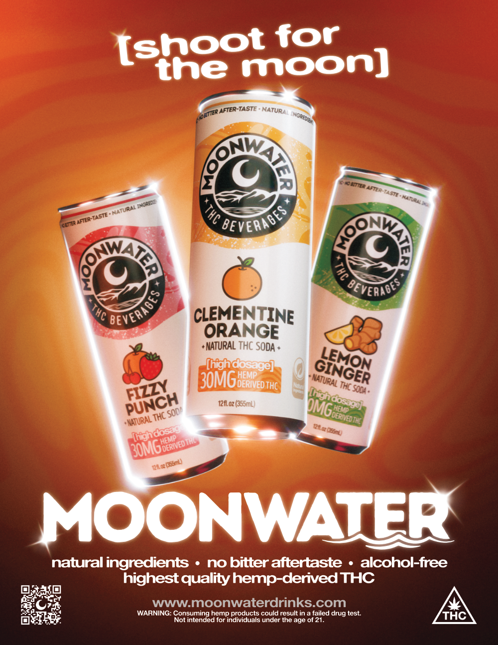
The second phase of packaging created a unified design system to support the brand's expansion into cans while ensuring consistency with bottles. Retaining the established emblem for brand continuity, the design was updated for clarity and impact. A standardized labeling block was added to the front of all packaging for clear, upfront dosage information. The color system was also updated with intuitive, flavor-driven choices, utilizing a consistent and vibrant color gradient on both cans and bottles to create a dynamic and unified look.


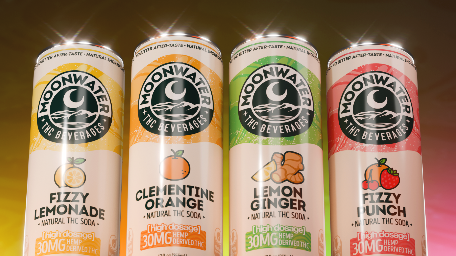
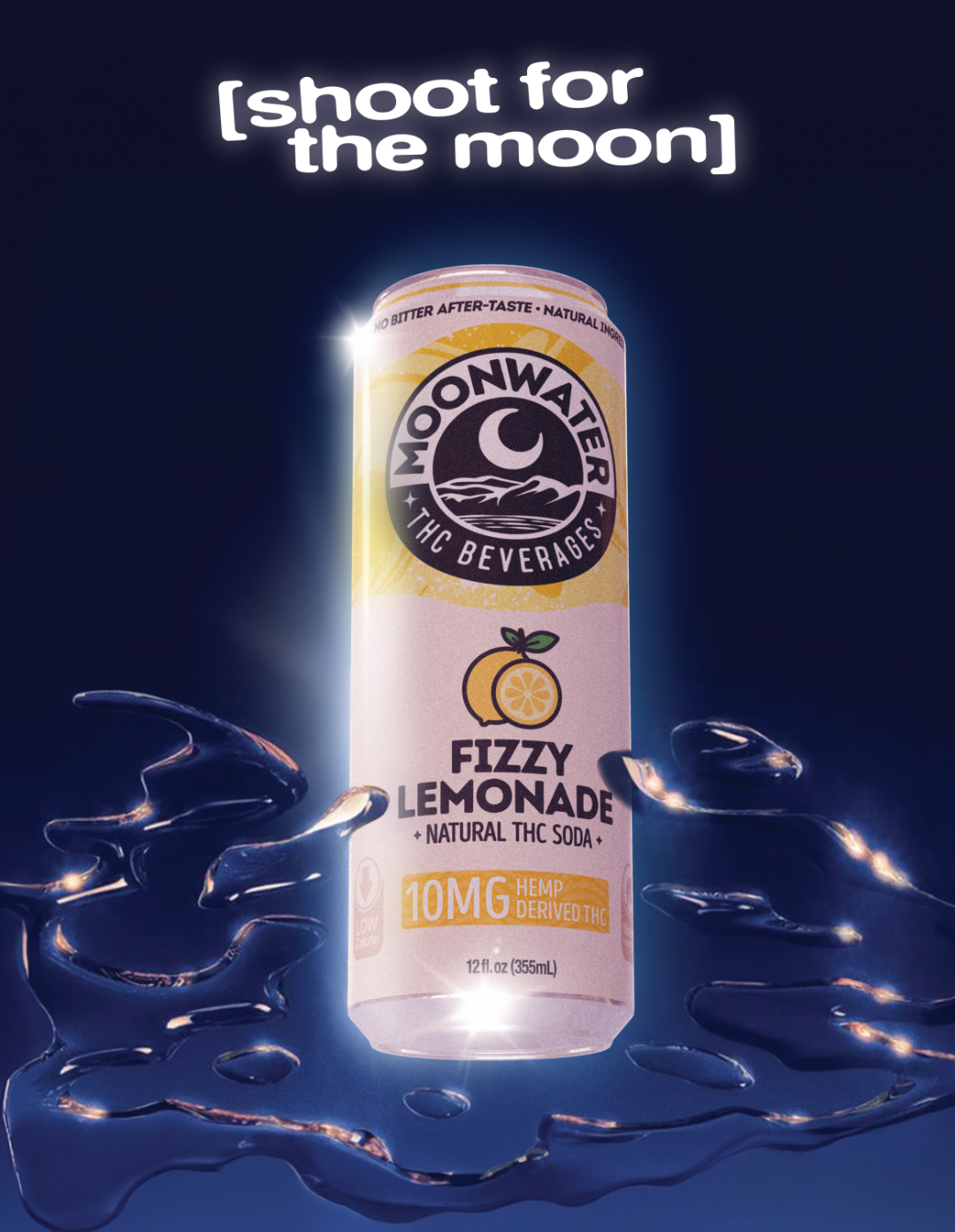
To target a wider consumer base for its new "all natural" line, Moonwater underwent a complete packaging redesign, moving exclusively to cans. The aesthetic evolved significantly, replacing the dark, topographic theme with a clean, bright design that feels more approachable for mainstream retail. This new look features the refined brand logo, simplified fruit illustrations, and enhanced clarity on key benefits and dosage, successfully repositioning the brand with a friendly, retail-optimized presence.

Packaging Redesign | All Natural Line


Brand Guidelines
Client
Moonwater Beverages
Year
2025
Website Bumpers
Client
Moonwater Beverages
Year
2025
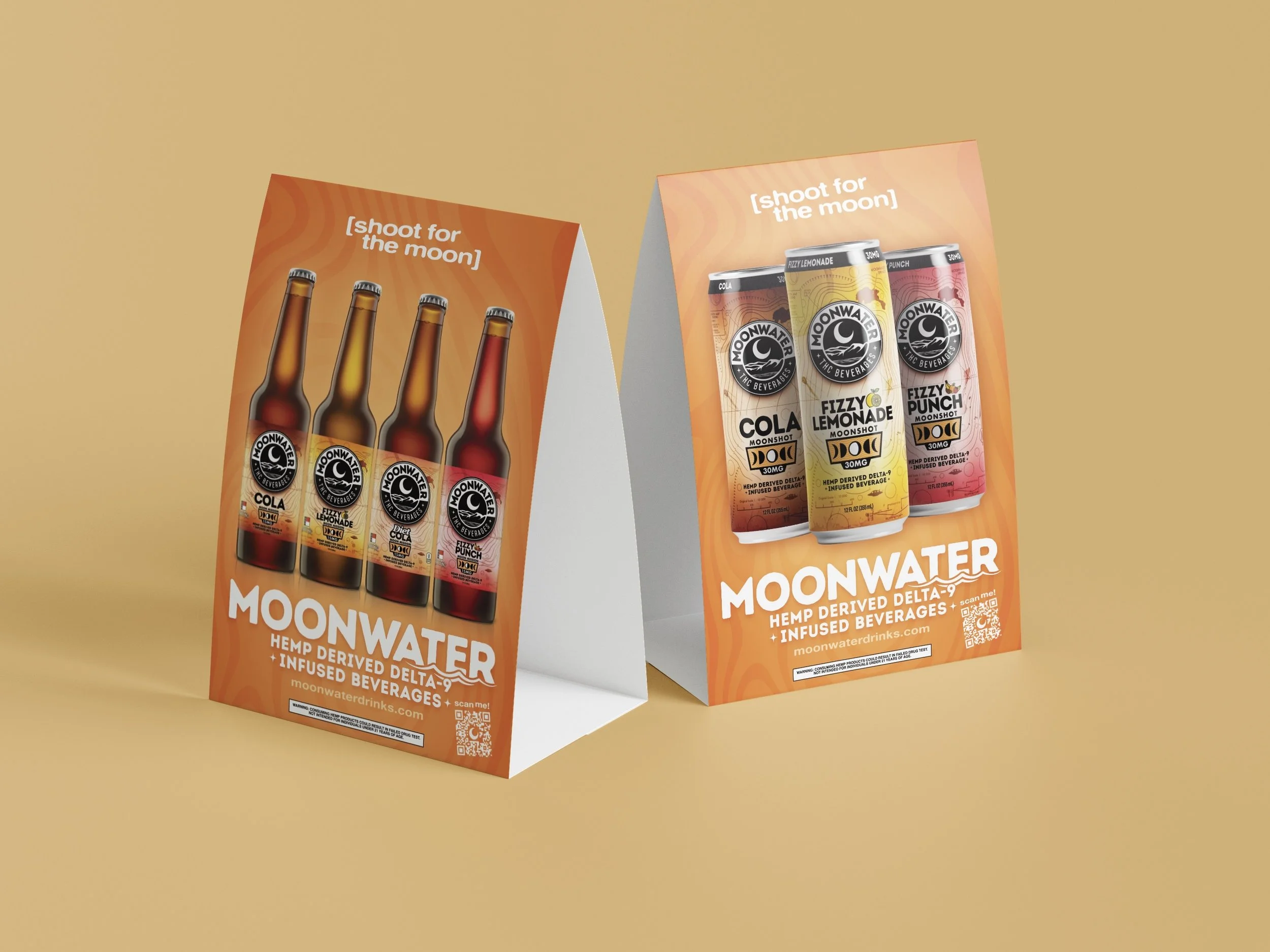
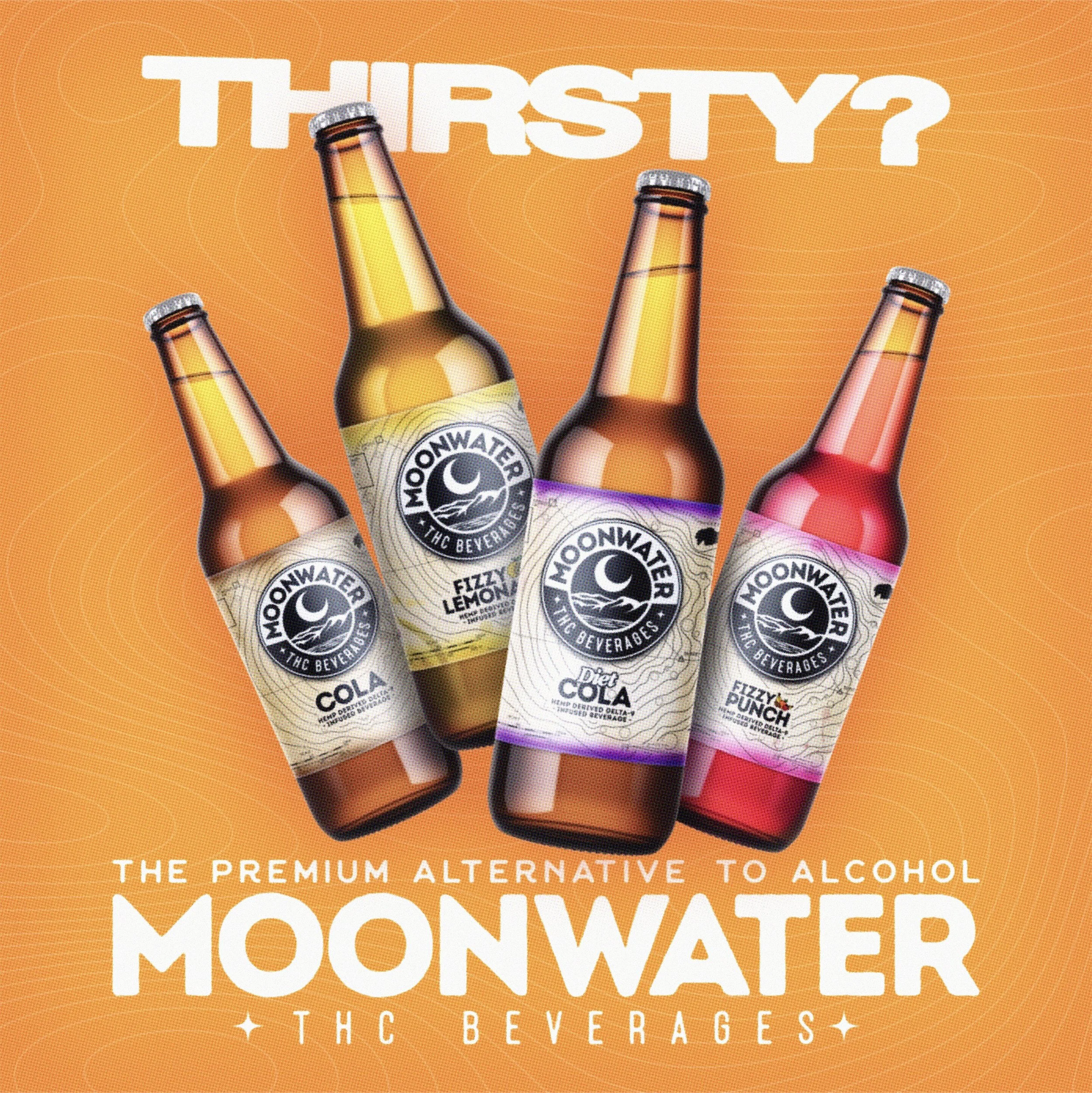
Marketing
Client
Moonwater Beverages
Years
2023 – 2025


Merch
Client
Moonwater Beverages
Years
2023 – 2024


